Azure Maps Power BI visual now in preview
The Azure Maps visual for Power BI will be releasing as a preview this week. Power BI is a powerful analysis and visualization tool. Azure Maps is an important tool for gaining geospatial context and insights that can be used in decision making.
This initial release includes the following visualization layers:
- Bubble layer
- 3D bar chart layer
- Reference layer
- Custom tile layer
- Real-time traffic overlay
In addition to these visualization layers, this visual also leverages built-in Power BI features, such as tooltips, color themes, as wells as filter and slicer support.
Bubble layer—represent location data as scaled circles
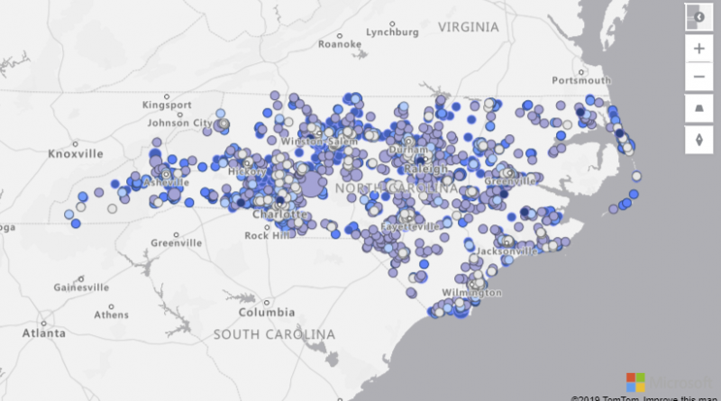
Bubble layers are a great way to represent location data as scaled circles on the map. Customers can use a linear scaling method or customize the scaling logic using a logarithmic or Cubic-Bezier curve. Additionally, users can pass a value into the legend field and have the fill color of the circles dynamically set; and, outline the circles with a single color or enable the high contrast outline option to have a high contrast variant of the fill color assigned to the circle to help ensure the circles are clearly visible regardless of which style the map is set to. Allowing the user to easily visualize two metrics for each location on the map, scale, and category.
For example, the following image shows bicycle accident locations in North Carolina. The color indicates the speed limit of the road the accident occurred on and the size is based on the number of individuals involved in the accident.
3D bar chart layer—visualize location data as 3D bars or cylinders
3D bar charts are useful for taking data to the next dimension by allowing visualization of location data as 3D bars or cylinders on the map. Users can tilt and rotate the map by holding down the right mouse button and dragging or use one of the navigation controls to view your data from different perspectives.
Similar to the bubble layer, the bar chart later can easily visualize two metrics at the same time using color and relative height. The following map displays store locations with bar heights representing the revenue generated from each location, colored by sales region.
Reference layer—overlay additional data layers to add more context
Power BI currently allows a single data set to be connected to a visual. However, when working with maps, its often desirable to be able to overlay additional data layers to add more context to a report. With this feature, a GeoJSON file containing custom location data can be uploaded and overlaid on the map. Properties in the GeoJSON file can be used to customize the style of the shapes.
For example, the following map image adds a GeoJSON file of census tract boundaries colored by population below a layer of addresses colored by real estate value. This provides insights on how population density is related to property values.
Custom tile layer—superimpose images on top of Azure Maps base map tiles
Overlay a custom tile layer on the map to add an additional layer of context. Tile layers allow you to superimpose images on top of Azure Maps base map tiles. Overlay weather data from the Azure Maps weather services or bring your own tile service.
The following map displays a bubble layer of sales data of store selling sunglasses above a tile layer showing current weather radar from Azure Maps. In this case, we can easily see that less sales of sunglasses are occurring where it is rain.
Real-time traffic overlay—see how traffic congestion relates to your data
Users can overlay real-time traffic flow data to see how traffic congestion relates to their data. For example, the following map is showing the position of field technicians rendered as a bubble layer on the map colored by their experience level and scaled by the amount of remaining time on their current job. Real-time traffic is overlaid on the map and provides a quick visual reference of which technicians are most likely be delayed getting to their next job due to traffic congestion.
Get started with the Azure Maps visual for Power BI
To get started using the Azure Maps visual, first enable it in the Power BI desktop app. To do this, open the options panel though File > Options and settings. Go to the Preview features options and select the Azure Maps visual. Once this is done you will also be able to use this visual in the Power BI website.
This is just the beginning! We have lots of exciting new features planned. Have a feature request? Let us know or vote for an existing request on our feedback site.
Learn more about the Azure Maps Power BI visual.
Source: Azure Blog Feed


