Bing Webmaster-Clarity Series #2: Rage clicks – what do they tell you about user behavior?
Rage clicks are when users repeatedly click/tap on a specific area of your website for a short period of time. This repeated clicking could signal that the user is frustrated or an element in your site may be broken! As users we have all been there when clicking on a button, image or link does nothing. As your frustration increases so do your clicks! By understanding this user behavior, you can optimize your page for the intended call to action. The major benefit of rage click analysis is the ability to find quick wins for fixing user frustration on your site.
Rage clicks with Clarity
The Clarity rage click feature enables you to spot areas in session recordings where a user repeatedly clicks on your website. This feature allows you to easily see what percentage of your user sessions have rage clicks and identify patterns. Rage click analysis can help identify potential problems with your site such as bugs, broken elements, or deadlinks. Remedying these issues will undoubtedly improve user experience and sequentially visitor behavior. Clarity rage clicks can be seen below via the pulsating blue dot.

With Clarity, you can sort rage click session recordings from the most rage clicks to the least. Allowing you to quickly see which elements on your page are causing the most frustration. This allows you to understand, fix and improve the user experience. Noticing where a user goes after rage clicking at speed will let you know what they were trying to do. This will allow you to remedy the issue for a more fluid user journey.
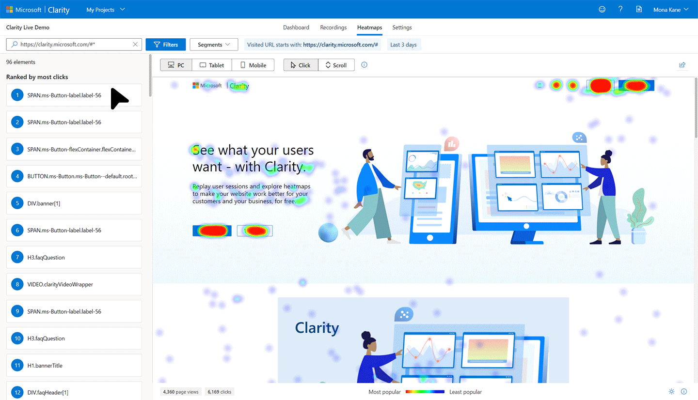
Rage click heatmaps
You can also see rage clicks through heat map colorization. The warmer colors show where most of the clicks happened.
Rage clicks can also be rage taps! Clarity can cleverly filter down by device, operating system, or browser helping you to optimize the user experience across multiple devices. For example, a high number of rage click recordings on your mobile checkout page could indicate a key element is not working and may possibly be impacting your conversion rates. Fixing the element can improve the experience, website advocacy, and sales.
Where do they happen the most?
Misleading buttons: A rage click can be a sign the user expected the button to do something. This could be an indication that the CSS selector is not working correctly and needs fixing. Inconsistent webpage design can massively impact usability and will need rethinking to correct.
To solve this, we need to answer important questions such as:
- What did the visitor expect to happen when they clicked the element?
- Why did the visitor think this element was clickable?
- What is the goal of the page and how can we guide them to it?
Dead links: Sometimes a sentence or word on your site can look like a link. This could be down to the font you choose or the color combinations on your page. If an element looks like it’s meant to be clicked, chances are it will. The below example shows a user wanting to track their order but can’t due to the dead link.

Wait time: There is nothing more frustrating than waiting for something to happen on a page, especially with today’s fast broadband and 5G speeds. If a user is on your site and it is taking a while for something to happen such as a file to load or video to play then expect lots of rage click action. Below you can see user frustration through rage clicks whilst they wait for the image to load.

Digging deeper with Clarity rage clicks
Rage clicks themselves will not show all the problems your users are experiencing. They are just one part of user frustration and possibly a poor customer experience. To build the full picture you need to combine them with other filters such as dead clicks.
Real-world example: Improving Bing search
Scenario:
Bing.com search team saw a large number of missed clicks on the search box
Findings:
A ‘missed click’ is a click by the user that does not bring about any change in the UX or the state of the web page. This is a common UX issue for buttons and links on many web properties. Missed clicks anywhere on the page are not good but are especially bad when on the search box which is the most important piece of UX on Bing.
With the help of Clarity, the team were quickly able to isolate the cause of missed clicks with Clarity rage click metric. Rage click recordings showcased that even though users were clicking on the search box multiple times, their clicks were being missed.
This impacted 4% of all the users that clicked on the search box.

Action:
This was a straightforward fix for the team. They resolved it by reducing the margins between the search box and the HTML form that contained the search box, specifically the top, left, and bottom margins.
Result:
Once the team rolled out the fix to production, missed clicks on the search box all but vanished, and not only that – they saw positive movements in user satisfaction metrics.

Here at Microsoft, we are passionate about helping users solve their customers’ pain points, that is why we created Clarity. It’s a free and easy-to-use web analytics tool. Try it out today to find rage clicks and other frustration signs on your website.
Source: Bing Blog Feed